Logos are an opportunity for a brand to showcase their strengths and values while also making a memorable statement that’s in line with current design trends. The release of new logos in the new year represents a fresh start for these companies and, in some cases, a necessary style update. Three of the first companies to release their brand refresh in 2021 are General Motors, Burger King and Pfizer.

General Motors
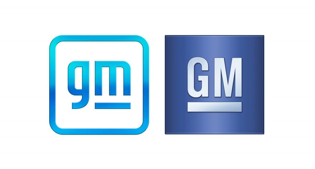
General Motors has shifted away from its previous logo—a dark blue square with white, uppercase, underlined “GM”—and replaced it with a light blue, lowercase “gm” with a gradient, centered in a white box and outlined in that same light blue gradient. Instead of underlining both letters, the underline is just under the “m.”
This shift not only represents a more “modern and vibrant” take on the old logo, but also signifies a shift in GM’s goals. The logo announcement is intended to be representative of GM’s commitment to building out its electric car fleet, having recently announced their intention to release 30 electric vehicles by 2025. The blue color scheme is meant to evoke “the clean skies of a zero-emissions future and the energy of the Ultium platform,” while the rounded edges and lowercase font give it a more modern, inclusive feel.
According to Sharon Gauci, the executive director of Global Industrial Design, there is more to this logo design than might first meet the eye. While the underline of the “m” creates a degree of continuity between this logo and past iterations, it also creates an image in the negative space which resembles an electric plug, a further nod to their commitment to electric.

Burger King
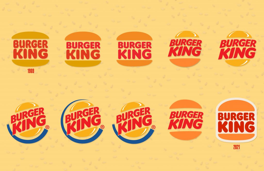
Burger King is another brand that’s embracing change in 2021, but this time with an updated blast from the past. The logo that has represented the popular fast food chain since 1999 featured a stylized yellow bun with red sans-serif typography sandwiched between its layers, oriented on an upwards diagonal and outlined by a bright blue c-shape. The new logo harks back to the logo that was utilized by the brand for over 30 years, between 1965 and 1998, albeit with a few key updates. This time the bun looks more realistic, the take is more modern, and the logo features a new font, custom designed for Burger King, and named “Flame.”
Raphael Abreu, head of design for Burger King parent Restaurant Brands International, noted the link to the past as part of the brands desire to return to the time when it looked its best, but the significance doesn’t stop there.
The new logo is also supposed to represent a shift in priorities for the company. While the 1999 logo was all about speed in conjunction with expanded drive through service, this new logo represents the focus on food that has become central to Burger King’s operations. “Our new logo is about our food,” Abreu said. “It’s what we’re known for and loved for. It’s more wholesome in a way.” This update comes at a time when the brand has removed artificial colors and flavors from its classic Whopper and is working to do the same with the rest of the menu, while also avoiding MSG and high-fructose corn syrup.
There are practical considerations to the update as well. The new, simpler logo will be easier to see on smaller screens—an important characteristic as ordering food from an app becomes more commonplace.

Pfizer
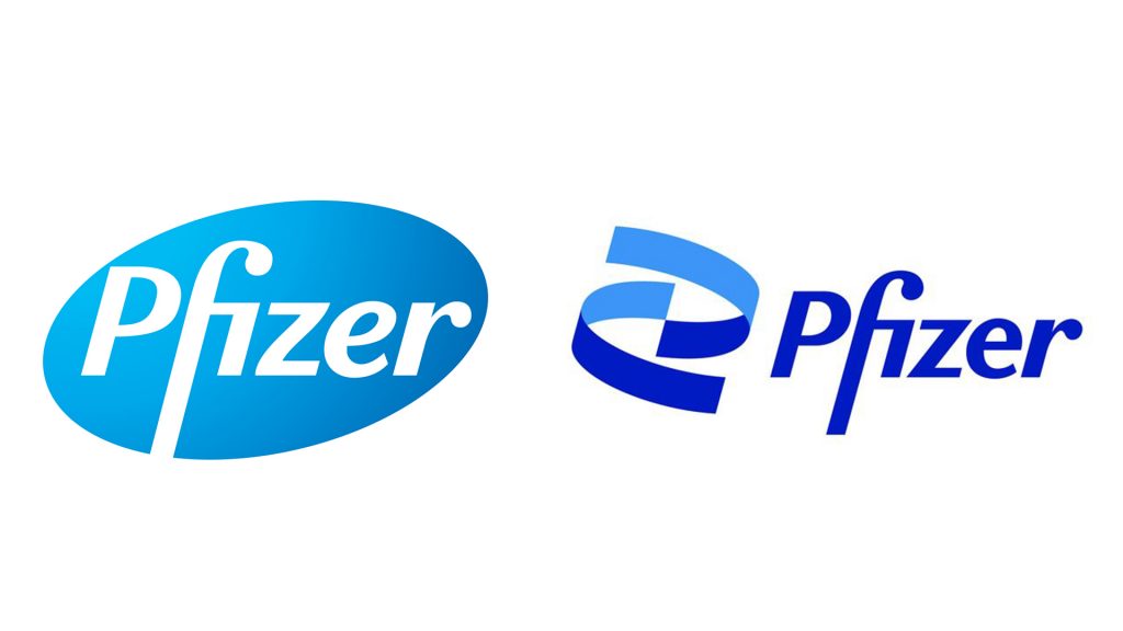
The release of their groundbreaking vaccine isn’t the only update Pfizer has gone through in the past few months. As of early January, Pfizer released a new logo and visual identity, the conclusion of an 18-month rebranding process. Their former logo was a blue pill shape with the company’s name overlaid in white whereas the new brand abandons the pill and replaces it with a two-tone blue helix spiral accompanied by the name, this time in dark blue.
Once primarily known as a collection of consumer brand drugs, Pfizer is shifting its focus “away from commerce” and toward the science-oriented core of its work. The company CEO, Albert Bourla, emphasized the logo’s role in broadening the scope of Pfizer’s mission on their website: “After 171 years, we arrive at a new era. A time of extraordinary focus on science and dedication to patients. Pfizer is no longer in the business of just treating diseases—we’re curing and preventing them.”
The familiar font connects the two logos and pays homage to the organization’s history, while the change in icon and expanded color scheme represent a shift toward innovation. Sally Susman, executive vice president and chief corporate affairs officer is quoted as saying: “Our new identity reflects the dignity of Pfizer’s history and captures the innovative spirit and science focus alive in the company today.”
Though these three companies come from vastly different industries, their updates all indicate one thing—significant shifts in organizational priorities. Whether it’s a focus on food quality, sustainable energy, or a more scientific approach to medicine, a new logo can be an opportunity to reframe a brand’s mission and commit to making substantial changes that go well beyond graphic design.
